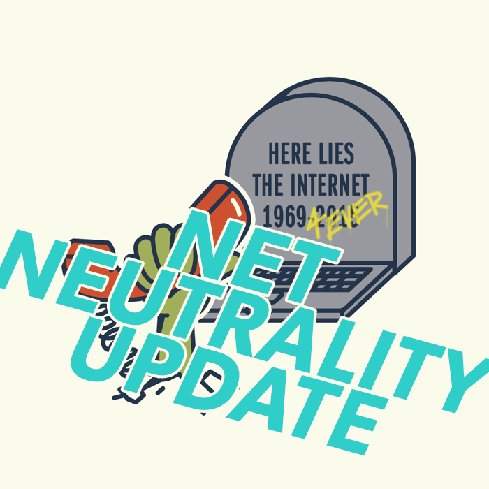
Back in 2015 you demanded that the FCC adopt strict net neutrality rules and establish a free and open internet. And you won.
That should’ve been the end of it. But apparently not.
The new head of the FCC wants to undo the net neutrality protections you fought so hard for.
His proposed changes open the door to your web traffic being slowed down, or even blocked altogether. You could be forced to pay extra to use your favorite apps. You could even be prevented from getting news from the sources you trust.
Title II protects consumers and democracy by ensuring all voices can be heard.
You know the drill. Here’s what to do:
The FCC is taking comments from the public, and dearfcc.org is making it as simple as possible for you to make your voice heard.
You’ll just need to provide a name, an address, and then say a little bit about why rolling back Title II protections is a bad idea. If you’re not quite sure what to write, here’s something to get you started:
I’m writing to urge you to keep our Open Internet rules based on Title II in place. Without them, we could lose the internet as we know it.
The proposed changes to FCC rules would allow fast lanes for sites that pay, and force everyone else into slow lanes. We’ve already seen access to streaming services like Netflix, popular games like League of Legends, and communication platforms like FaceTime slowed down, or even blocked. Conditions like this hurt businesses large and small, and penalize the users who patronize them.
The changes also open the door to unfair taxes on internet users, and could also make it harder for blogs, nonprofits, artists, and others who can’t pay up to have their voices heard.
Please leave the existing net neutrality rules based on Title II in place.
one of the best tips for Real Life that I’ve ever picked up is to always highball your estimate whenever someone asks you “when can you get this done by” by about 25% (if you can get away with it). that way, if it ends up being harder than you thought, you’ve got extra time to figure things out and if you were right about how much time it takes then you get to look like an absolute genius instead of just a simply competent person.
what you may not have realized is that I learned this crucial piece of life advice from an episode of Star Trek where Scotty is telling Geordi that whenever he told Kirk something on the Enterprise was at full capacity, it was always only ever a notch or so below full capacity so that Scotty looked like the god of all engineers when he was able to magically hack the warp drive to run a little beyond what he’d told everyone else was “full capacity” and honestly that one throwaway gag from Star Trek has changed my life.
You can subconsciously take
on attributes of your favorite
fictional characters while reading
a story. It’s called ‘experience
taking’, and it sometimes leads to
temporary or even permanent
changes in your real life. Source
People have asked this sort of thing before, and my thoughts on it are similar. Not my most articulate response, as I’m writing on my phone from a plane. But, I wanted to post this because he said something I’ve seen often, but rarely seen mentioned- having a lot of projects going at once. The death of growth for many creative friends has been this project jumping thing.
as a former yearbook editor and designer, let me explain this further
if youre only planning on posting your art online, them please save it as .png ;this is also better for transparencies as well
BUT
please, if youre planning of printing your art, NEVER use png. it makes the quality of the image pretty shitty. use jpeg or pdf instead. and always set your work at 300dpi to get a better printing quality - this means, the images are crisper and sharper and theres no slight blurriness. i had a talk with my friend who is currently taking design, and pdf is much better to use when youre working with a bigger publishing company because it still has the layers intact, but if youre only planning on printing your stuff at staples or at some small publishing store, the jpeg is the way to go.
this has been a public service announcement
I’ve replied to this once before but I see it’s doing the rounds again.
This is all utter bullshit.
I’m sorry but if your qualification is working on the school yearbook, you have no qualifications. Do not pretend otherwise. As a former professional photo manipulator for advertising brochures, I can say that you’re not comparing apples to oranges here - if anything, you’re comparing fruit to farmyard machinery:
JPEG is a lossy format. It is suitable for web imagery because it sacrifices detail for reduced file sizes, but in doing so it introduces artifacts that weren’t in the original; if you load a JPEG for editing, then save it as a different JPEG, then you’re adding more artifacts formed from those first artifacts. Do this often enough and you end up with a horrid glitchy mess that looks like a puddle’s reflection after a stone’s been thrown in. You’ve seen those memes that have 3 or 4 different “found at” tags along the bottom, that look like fingerpainted copies of the original? That’s why.
PNG is a lossless format that comes in two primary flavours, PNG-8 and PNG-24, which use 8 and 24 bit colour respectively. 8-bit colour is what you have in GIFs, a limit of just 256 different colours in a predetermined palette, usually automatically chosen by your software when saving. These files will look the same as GIFs, potentially with large patches of solid colour instead of the usual gradual shading seen in 24-bit imagery. This is usually better for small banners or pixel art, as it can yield smaller filesizes than GIF format. (There is an animated version called MNG but it has very little web support, hence the continued use of GIFs.)
PNG-24 is great for larger images where detail is as important as colour depth, as well as printable RGB images and (if supported by the client) full colour images with gradient transparencies. It most certainly does not make “the quality of the image pretty shitty,” as it preserves every nuance. File sizes can be smaller than JPEG for small images, or significantly larger for large images.
PDF is a container file, whatever you put into it will be pretty much preserved as it was, so you gain nothing but lose nothing.
TIFF is what you need to be using for archival or print-quality imagery. It has support for multiple layers, multiple colour channels (RGB as well as CMYK, which is essential for accurate print rendering), and everything is preserved exactly as it was seen on-screen when being composed. There are compressed versions available, they use similar methods to PNG in order to maintain detail without sacrifice; next to whatever your graphics program uses natively, this is the most interchangeable format available for professional use.
DPI is important only when used in combination with image dimensions; in and of itself it serves no purpose. If you make a brilliantly detailed 640x480 image & set it to 300dpi, you’ll receive a brilliantly detailed 2 inch x 1.6 inch print. This is great if you want to make a postage stamp, but not if you’re creating an A4 flyer! Determine the image’s dimension then set the DPI accordingly; 72dpi isn’t hideous especially for text-heavy work (it’s ~3 pixels per millimeter), and 150dpi can be suitable for many images. Unless you’re interested in photo realism, 300dpi is usually overkill - for our hypothetical A4 flyer, you’d need a file of 2490x3510 pixels for edge to edge printing, with a correspondingly high memory requirement and filesize even if using a compressed format.
Keeping the layers intact is utterly unimportant for print work unless you want to use a separated colour print method that requires multiple passes to lay down each ink. If you send a file with all the layers, masks, etc. off for printing you’re liable to get it sent back unactioned, as they won’t want to take responsibility for choosing the wrong elements for printing. Save your work with everything intact, then save a flattened copy especially for printing purposes - this is one of the reasons Save Copy As… is a common option in graphics manipulation software.
This has been a Public Service Rebuttal.
FUCKING THANK YOU
As a designer who’s worked a few years for a newspaper, I cannot begin to tell you how much OP’s post (edit: response, technically) made me cringe. I would have killed to get a photo as a TIFF for once instead of having to tear apart PDFs only to find a 50x100px 72dpi shitty JPEG inside for the 5 millionth time…
JPEG and PNG are best suited for web formats (and it is perfectly fine to save your web version as JPEG, that’s what it’s goddamn for). You will make a designer cry if you send a web-safe JPEG for print, however. And if you have a vectorized logo saved as EPS (or even better, AI), you will make that designer’s year.
Guys. Guys this is important.
This is very fucking important for me as a Media and Electronic student this saved my goddamn life.
Reblogging myself because… what was that? Five minutes?
O_O
………my friend has made me curious
help me roger
Update: after I reblogged this someone messaged me offering me tickets to the sold out Hausu screening with a Q&A and autograph session with the director
Hi, I'm Tim Lai! I'm a cartoonist living in Ontario, Canada. I like drawing cute and colourful things. This blog is a hub where you can find all of my Tumblr, DeviantArt, Flickr, Blogspot, and other posts in one place.
About My Work
I write and draw Lemon Inc., a comic about a seven-year-old who wants to be a business tycoon when he grows up. Until then, he runs a lemonade stand. You can read it at www.lemon-inc.com.
I have done some professional web and graphic design work, including designing the website for the webcomic, Just Joel. I'm also a member of the webcomic collective, Ink Bomb Comics.


staff: