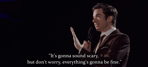
my goodness look at the amount of detail on this one. the colors, the shading, everything is just spot on. you can almost make out the individual feathers. truly a marvelous mallard. 10/10
i see they went with one of those brown varieties of duck. while this is a bold move on their part, i feel as though it loses a bit of its personality. i’m just not really feeling this bird. 7/10
this looks like a modern colorization of the famous duck from the hieroglyphs. i am absolutely in awe of their dedication to the medium and commentary on the transformative nature of art. 10/10
look at this good boy! he is patiently awaiting a treat and i wish to reward him with a multitude of gifts. 11/10
yuck. 2/10
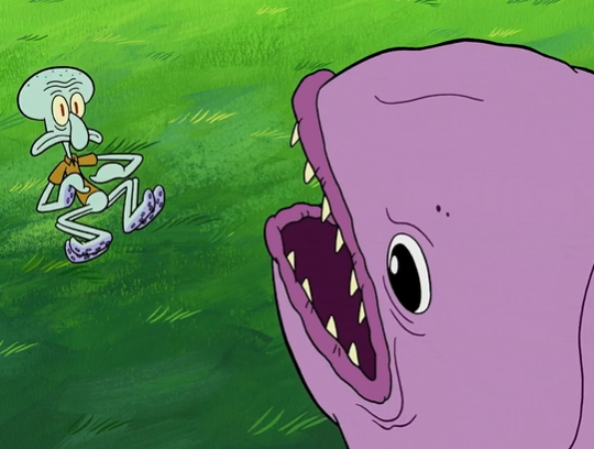
ohoho, what a dynamic three quarters angle! the artist’s ability to capture the essence of duck in 3d space is so refreshing to witness. 10/10
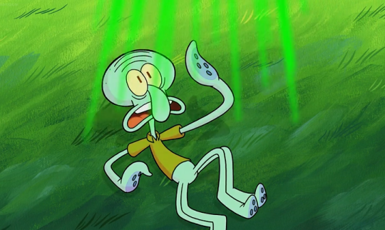
this bird’s looking a bit sickly, i think it has to do with the highlights being in weird places. hope he feels better soon. 5/10
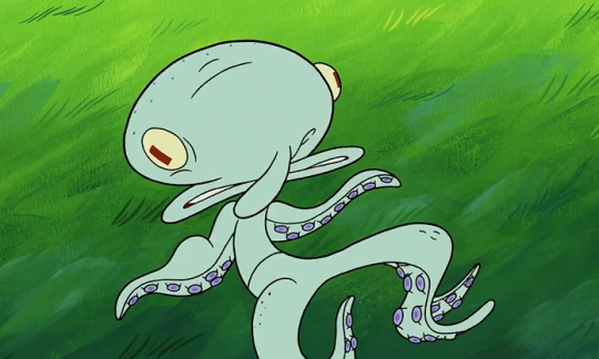
a bit more minimalist this time around. the lack of legs makes it seem as though he’s resting on the surface of the water, and i really admire how it sets a scene and makes me feel like i’m really there. 9/10
i’m really digging the positive energy coming from this bird. i can’t explain why, but i feel like that animal’s my friend. 10/10
this is a goose. 0/10
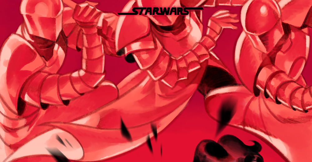
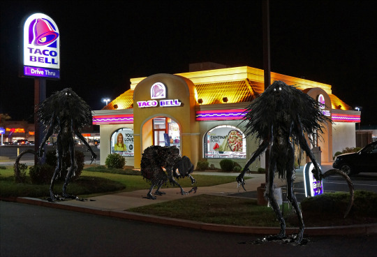
I’m crying at the pure rage I feel from the last one
people are STILL OUT HERE IN 2018 W BLACK TEXT ON DARK PURPLE AND DARK BLUE BACKGROUNDS. WHY.
lads, literally the very first rule of web design is READABILITY.
you have to have contrast between your background and your text.
like…….you pretty much can’t have a dark background if you have black text because it’s super difficult to read; if i have to highlight and puzzle out what your text says because it’s two shades different than your background? i and 95% of people looking at your page are going to hit that back button REAL fast
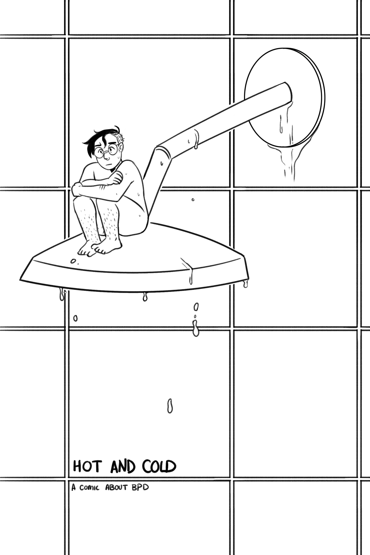
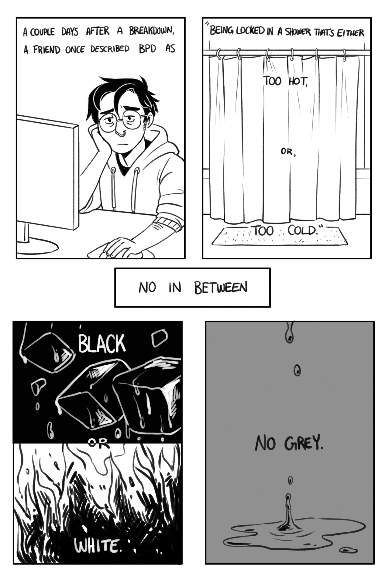
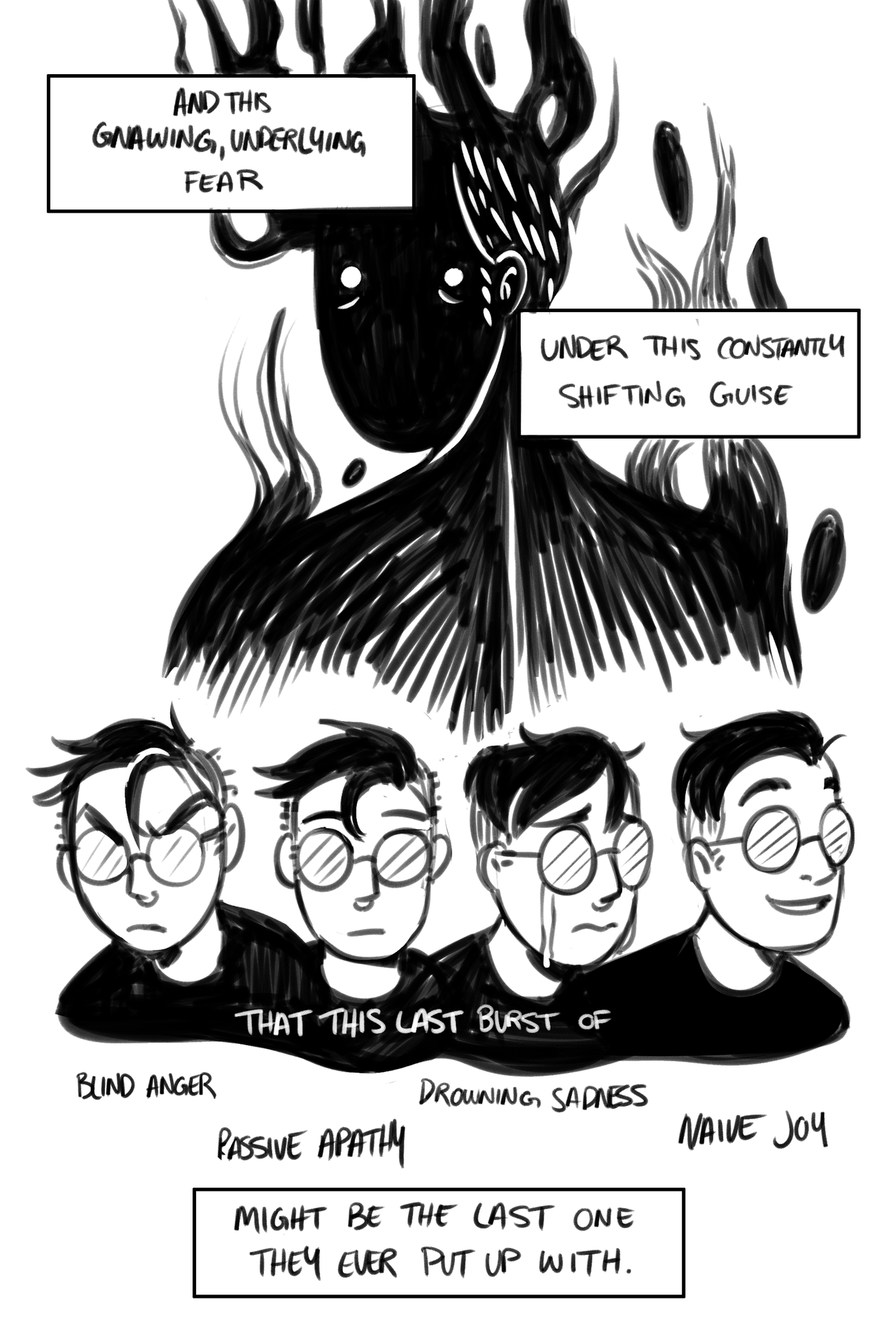
It’s BPD Awareness Month! so I drew a comic for it!
It got rougher by the end, but I don’t mind, really. I’m not really sure what to say here, other than things can and will get better, and I’m rooting for you.
Man found the stoplight cameras were activated during yellow lights and decided to cut the wires of it.
hero
STOP SCROLLING!!! Please take a moment to read the article about what this man is doing, the criminals he is exposing, and the deaths of so many poor and middle class families at the hands of the greedy. Yellow lights with Xerox cameras were shortened from 5 seconds to 3 seconds in poor and middle class neighborhoods to surprise drivers and generate more revenue. Many deaths ensued. This story is already a couple months old, but there isn’t enough talk about it. Please signal boost this.
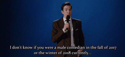
i know i’m consistently shocked by the totally normal progression of time but i genuinely can’t believe it’s already 2018 i feel like 2014 was like six minutes ago… but also at the same time 2017 felt like it lasted 45 years so??? not sure what’s going on anymore
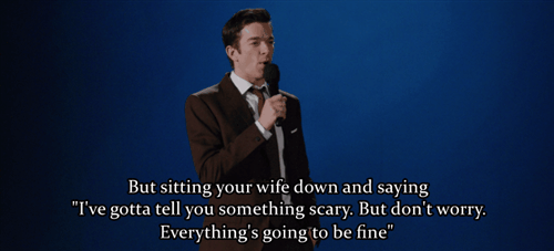
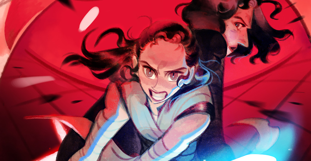
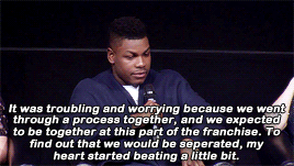
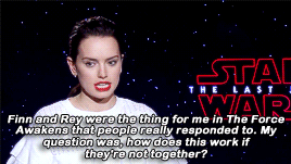
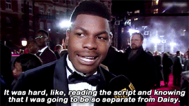
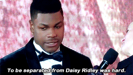
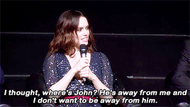
It was horrible when I read the script for the first time and I wasn’t with her. We auditioned together. We went through this whole experience together. To be split apart was scary for me. - JOHN BOYEGA I felt the same when I read the script, I didn’t cry right away. I was like, “Wobble, wobble, wobble, [shaky voice] I’m probably going to cry and I need to see Rian.” Then I went into Rian’s office and I was crying my eyes out. - DAISY RIDLEY
Hi, I'm Tim Lai! I'm a cartoonist living in Ontario, Canada. I like drawing cute and colourful things. This blog is a hub where you can find all of my Tumblr, DeviantArt, Flickr, Blogspot, and other posts in one place.
About My Work
I write and draw Lemon Inc., a comic about a seven-year-old who wants to be a business tycoon when he grows up. Until then, he runs a lemonade stand. You can read it at www.lemon-inc.com.
I have done some professional web and graphic design work, including designing the website for the webcomic, Just Joel. I'm also a member of the webcomic collective, Ink Bomb Comics.


younger-chuckles: