To be fair, Chandra Arya didn’t vote for the Barbaric Cultural Practices Bill (he wasn’t an MP then), but Justin Trudeau did and almost every other Liberal MP did (including a lot of current cabinet ministers):
Help requested for the march! If you can do any of these things and want to help them, see the email address at the top of that capture: scientistsmarchonwashington@gmail [dot] com
People in the notes are upset about “humanizing GWB” lmao
Important to note that he’s painting a series of portraits of veterans who were injured carrying out his orders in Iraq and Afghanistan as part of an art therapy program.
I don’t work at Cartoon Network any more. But I’m going to give you a very quick portfolio review in hopes that you find it helpful!
Here are some things I noticed when looking at your stuff - lessons I learned from brilliant people while working on AT for two years:
1) AVOID SYMMETRY. Humans are organic, randomly shaped animals. Perfect symmetry rarely exists in nature and if it does, it’s conspicuous - it’s the exception rather than the rule. Find interesting ways to throw your characters off-balance.
Don’t repeat objects in twos - (buttons or rips or whatever) - it feels prescribed - cluster things in threes or fives if necessary.
2) AVOID CONCAVITY - I don’t know what else to call this. But it’s those lines that go “in” rather than “out”. You are using inward sloping lines to describe many of your characters. As an exercise, try using outward, rounded, voluminous lines to draw EVERYTHING. Humans are fleshy lumps connected together by other fleshy lumps. Each mass is either in front of or behind other masses and as a designer, it’s your job to tell the animator where it is. As a designer, you are providing a technical blueprint for the location of masses.
Only occasionally allow a concavity to connect two convexities. Look at the work of Robert Ryan Cory (spongebob), Tom Herpich (Adventure Time) or Phil Rynda (AT / Gravity Falls) - master character designers - for examples of this. If you need to, trace a couple of their drawings and you will see what I mean.
3) AVOID GRAPHIC DETAILS - Some shows use a graphic style; it’s very appealing and looks clever when done right. But in animation, everything needs to move in space - so if you use a graphic element - it needs to correspond with an actual 3D thing that can move. Therefore it is better to start with a voluminous style and then revert to graphic elements where appropriate. Art directors will look for this. Do not jump straight to graphic representation if you do not yet know what you are representing.
Look at the work of Tiffany Ford and Jasmin Lai for amazing examples of volume expressed graphically.
4) STUDY JAMES MCMULLEN - To truly understand volume, and fully respect your subject, you should read very carefully High Focus Figure Drawing by James McMullen. Slow down and think about drawing “around” your subjects. It’s a truly meditative experience when you get there. Think about the weight and mass that your characters, props and effects are experiencing. Many students from SVA - Tomer Hanuka, Becky Cloonan, Rebecca Sugar, James Jean - studied under McMullen’s philosophy and you can see this common richness in their work.
Jeffrey Smith, a top student of McMullen’s now teaches life drawing at Art Center. These are two of the best illustration schools in North America - anyone who is interested in drawing living things, should probably read his book.
Also look at the work of Andy Ristaino or Danny Hynes - two other character designers’ whose work is seething with volume.
I hope this is useful and I hope you have a wonderful career.
“…last
year this photograph of children looking at their smartphones by Rembrandt’s ‘The
Night Watch’ in the Rijksmuseum in Amsterdam
[went viral.] It was often accompanied by outraged, dispirited comments such as
“a perfect metaphor for our age,” “the end of civilization” or “a sad picture of
our society”.
…It turns out that the
Rijksmuseum has an app that, among other
things, contains guided tours and further information about the works on display.
As part of their visit to the museum, the children, who minutes earlier had admired
the art and listened attentively to explanations by expert adults, had been instructed
to complete an assignment by their school teachers, using, among other things, the
museum’s excellent smartphone app….
The tragic thing is that this — the truth — will
never go viral. So, I wonder, what is more likely to bring about the death of civilization,
children using smartphones to learn about art or the willful ignorance of adults
who are too quick to make assumptions?” José Picardo, Medium
While admissions of white adults to Canadian prisons declined through the last decade, Indigenous incarceration rates were surging: Up 112 per cent for women. Already, 36 per cent of the women and 25 per cent of men sentenced to provincial and territorial custody in Canada are Indigenous—a group that makes up just four per cent of the national population.
Trudeau’s response perfectly encapsulates Trudeau and his milquetoast “liberalism.”
Okay, but Trudeau’s maternal grandfather moved from Scotland to Canada in 1911. 1911. He was 3 years old at the time. And, historically, it’s debatable whether that would have even constituted “immigration” at the time, so much as internal migration from one part of an empire to another part.
Hi, I'm Tim Lai! I'm a cartoonist living in Ontario, Canada. I like drawing cute and colourful things. This blog is a hub where you can find all of my Tumblr, DeviantArt, Flickr, Blogspot, and other posts in one place.
About My Work
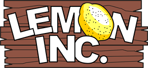
I write and draw Lemon Inc., a comic about a seven-year-old who wants to be a business tycoon when he grows up. Until then, he runs a lemonade stand. You can read it at www.lemon-inc.com.
I have done some professional web and graphic design work, including designing the website for the webcomic, Just Joel. I'm also a member of the webcomic collective, Ink Bomb Comics.


chatnoirs-baton: